Gratimo Grotesk vs. Classic
Bridge Text & Head
Grato’s geometric core by the wonderful Jakob Runge was the starting point for its compagno Gratimo. The whole family varied by two stylistic choices — changes to the cut of terminals and proportions of the uppercase letters — that core makes a Grotesk and a Classic. For more efficient and utilitarian work, they were redrawn for text and interface: Gratimo Grotesk and Gratimo Classic. Find out more about the whole family ☞ Grato & Gratimo tutti completi
foundry: typemates.com
category: type design, sans serif
designer: Jakob Runge, Mona Franz
contributions: Irene Vlachou, Ilya Ruderman & Yury Ostromentsky, Donny Truong, Christoph Koeberlin, Igino Marini
graphics: Paul Eslage
year: 2021


Gratimo Grotesk is an utilitarian family purpose-built for everyday use, a powerful workhorse in the Geometric Suite that combines elementary shapes and precise construction.
Where Grato Grotesk revels in pure geometry, Gratimo Grotesk has a practical focus. With a robust x-height, open apertures and generous spacing, its more restrained forms were the result of Grato being redrawn for reading. The result is a neo-grotesque that draws on American Gothics from the early 20th century and makes something fresh.
An allrounder specialising in smaller reading sizes and lower resolutions, Gratimo Grotesk is suitable for user interfaces and longform writing. With a compact texture, it is efficient, robust and ready to work at any size. This sans is a long-lasting companion for brands that value diversity in language and clear screen performance.
Read more! ☞ Gratimo Grotesk


Gratimo Classic is a powerful workhorse in the Geometric Suite that combines elementary shapes and precise construction. An utilitarian family purpose-built for everyday use.
Where Grato Classic revels in pure geometry, Gratimo Classic has a practical focus. With a robust x-height, open apertures and generous spacing, its more restrained forms were the result of Grato being redrawn for reading. The result is a space saving typeface that draws on the humanist geometric types of Johnston and Gill to make something new.
An allrounder specialising in smaller reading sizes and lower resolutions, Gratimo Classic is suitable for user interfaces and longform writing. With a compact texture, it is efficient, robust and ready to work at any size. This sans is a long-lasting companion for brands that value diversity in language and clear screen performance.
Read more! ☞ Gratimo Classic
Selected Works
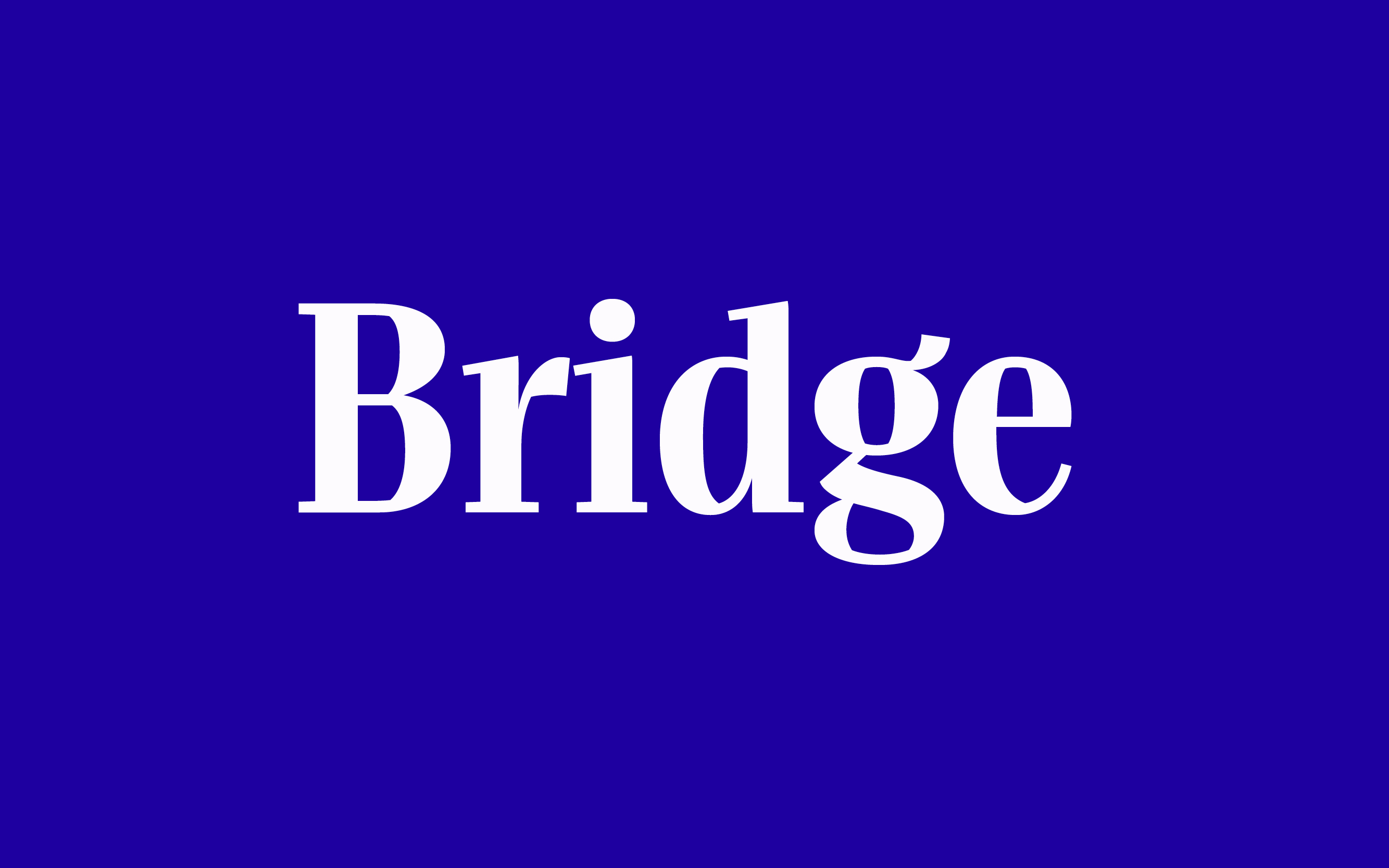
BridgeType Design
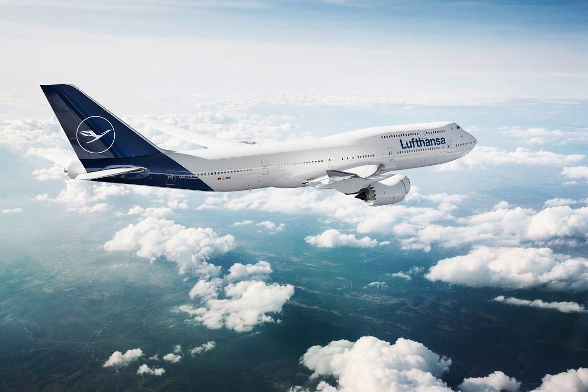
Lufthansa RefreshCorporate Design
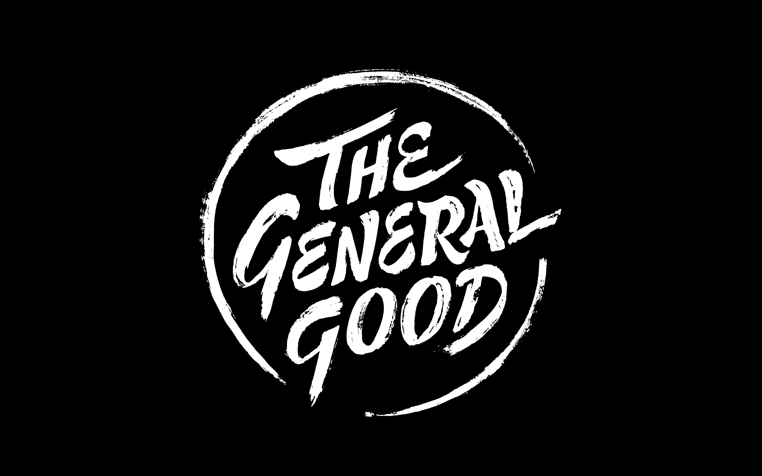
The General GoodLettering
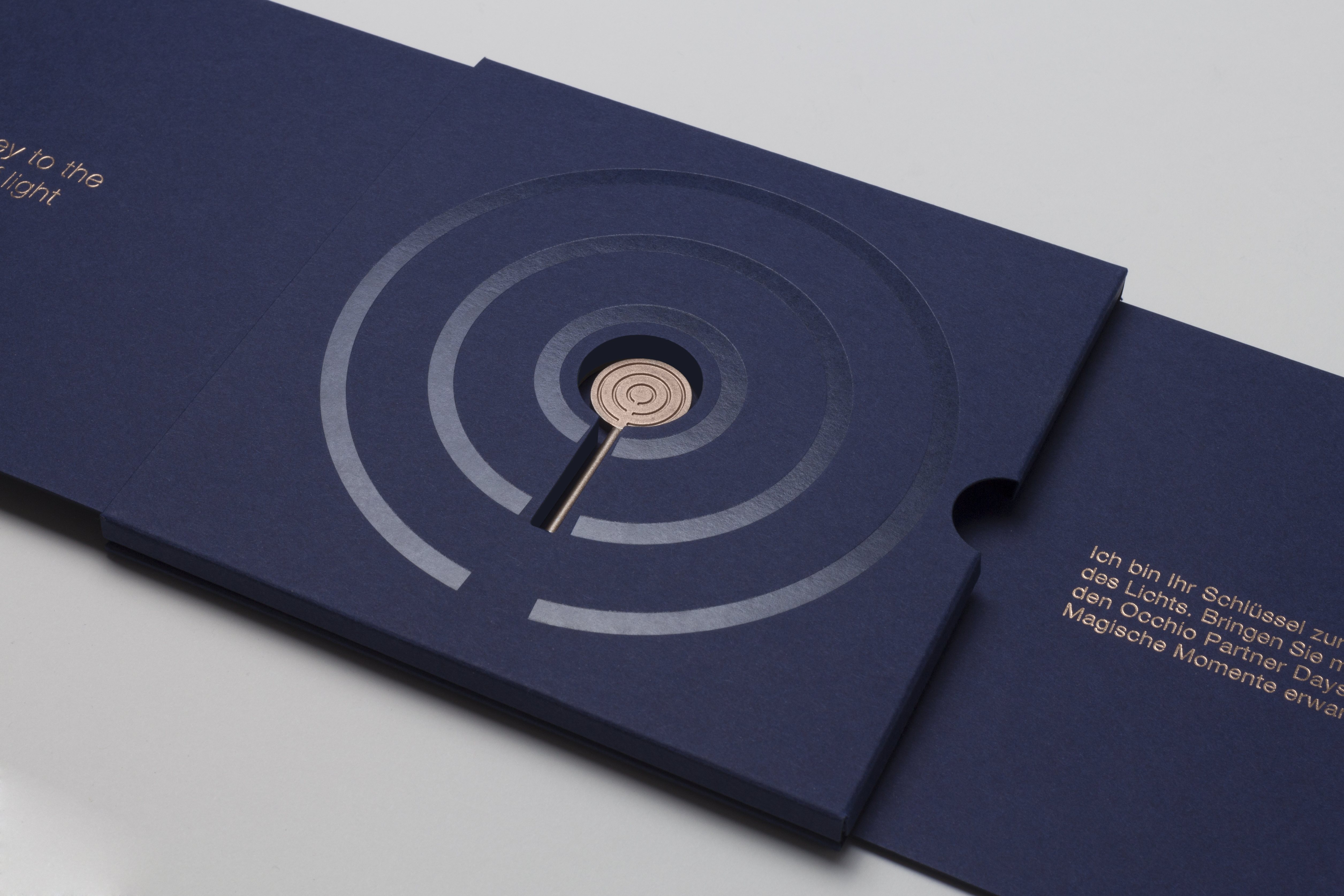
Occhio — partner daysProject type
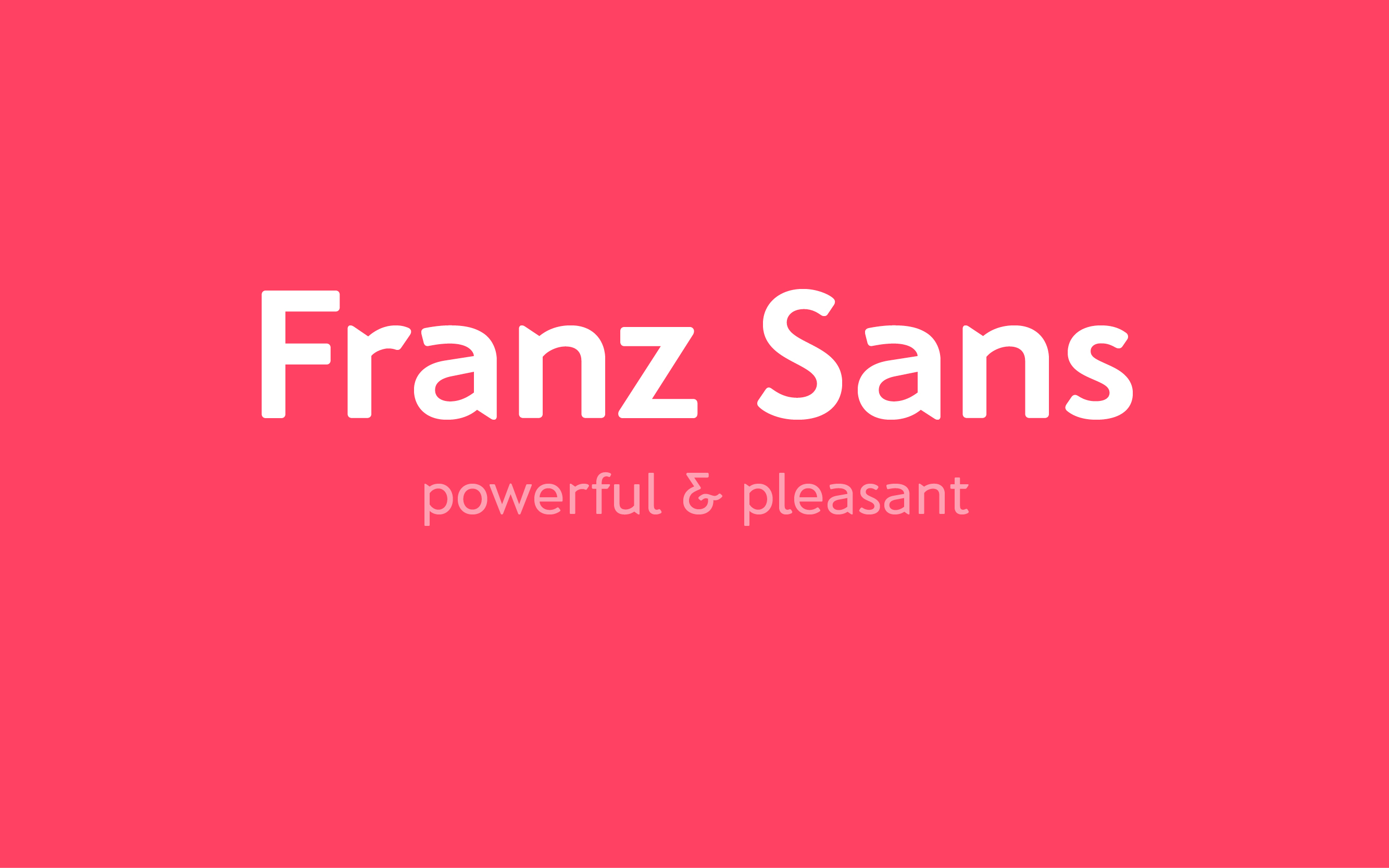
Franz SansType Design
why don’t you…
just call me!
just call me!
just call me!
email me at hey[ät]monafranz.com write a letter to Mona Franz, Kapuzinerstr. 22, 80337 Munich be my friend or whatever on facebook follow me on instagram check out my never updated behance visit me on franzsans.de anyways, let’s stay in contact on linkedIn or xing tweet something @mona_franz_ talk to me!
email me at ?Subject=Hello%20There!">" data-mce-href="">hey[ät]monafranz.com write a letter to Mona Franz,
Kapuzinerstr. 22, 80337 Munich be my friend or whatever on facebook
follow me on instagram check out my never updated behance visit me on franzsans.de anyways, let’s stay in contact on LinkedIn or Xing tweet something @mona_franz_ talk to me!
email me at ?Subject=Hello%20There!">" data-mce-href="">hey[ät]monafranz.com write a letter to Mona Franz, Kapuzinerstr. 22, 80337 Munich be my friend or whatever on facebook follow me on instagram check out my never updated behance visit me on franzsans.de anyways, let’s stay in contact on linkedIn or xing tweet something @mona_franz_ talk to me!
email me at ?Subject=Hello%20There!">" data-mce-href="">hey[ät]monafranz.com write a letter to Mona Franz Mona Franz, Kapuzinerstr. 22, 80337 Munich be my friend or whatever on facebook follow me on instagram check out my never updated behance visit me on franzsans.de
anyways, let’s stay in contact on linkedIn or xing tweet something @mona_franz_ talk to me!
email me at hey[ät]monafranz.com write a letter to Mona Franz, Kapuzinerstr. 22, 80337 Munich be my friend or whatever on facebook follow me on instagram check out my never updated behance visit me on franzsans.de anyways, let’s stay in contact on linkedIn or xing tweet something @mona_franz_ talk to me!
+49 176 640 985 74
+49 176 640 985 74
+49 176 640 985 74